|
|
|
|
Subject: Histograms interface to analyse heterogeneity within a population
From: Nicolas Becu (becu@uni-hohenheim.de)
Date: Wed Mar 15 2006 - 13:29:50 CET
Dear all,
In an attempt to better characterize heterogeneity within a population of
agents and to embed this analysis within Cormas, I’ve implemented a
“histograms interface” that enables showing the distribution of agents (or
other entities) according to one of their quantitative attribute (e.g. age,
income).
The HistogramsInterface tool plots your data into a histogram which
rectangles’ heights correspond to the number of occurrence in each class
(classes being for example people from age 10 to 20, then from age 20 to 30
etc…).
I didn’t manage to integrate this Histograms tool within the Cormas menus so
it works has a “adds-on”.
To use it you should proceed as so:
- first “File In” the st file attached
- in the init method of your model write the following line
“HistogramsInterface newWith: self” (the line can be placed anywhere in
your init method)
*** from now on, a new interface, the “histograms interface” will open
each time you init your model ***
- in your model class, create a new protocol named “histograms”
**in this protocol you can now add as many histograms definition you
want**
- the syntax of a method defining a new histogram is as so:
- it should return an Array instance composed of 2 OrderedCollection
(or one OrderedCollection and one Array)
- the first value of this Array is the collection of quantitative
values you want to plot in the histograms (e.g. a collection of age of an
agents population)
- the second value of this Array is the classes to which you want to
plot your data (e.g. to define 3 classes of age - for example 0 to 30; 30 to
60 and 60 to 90 – you would enter the following value #(0 30 90 100). )
***note that 2 additional classes will be created: one for all
values less than your lowest class; and a second for all values higher than
your highest class****
That’s it. You’ll then see after initialisation the list of histograms that
you have defined and you can select one to see the distribution.
You can go on for some step in the simulation and refresh the histogram by
unselecting it and selecting it again to see the new distribution.
If you’re not satisfied with the classes you have define you can either
change them in the method you wrote earlier, or set a new classes directly
in the “Histograms Interface” tool (click the “Change chart classes” button,
then add and define as many classes as you want).
I hope this tool will be useful for you as it is for me :)
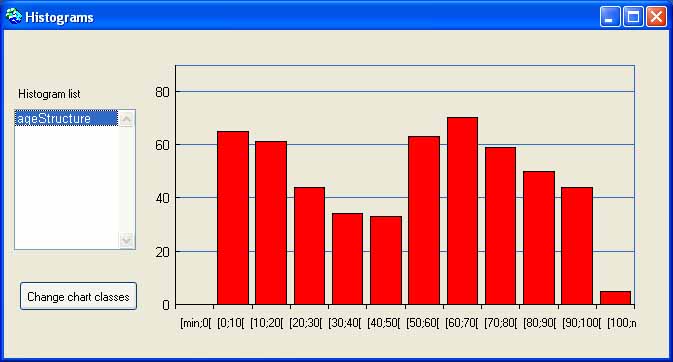
I’ve added a model example so that you can see how it works – the “BabyBoom
model”!! You’ll still need to “File In” the HistogramsInterface st file
first. With this model you’ll see changes in the age structure of the
population during the simulation (20 steps is enough and better go step by
step after you’ve reached step 10). You can see how the histogram interface
looks like in the attached jpg file.
Just for fun I‘ve also added an update of the GiniTest model where you can
see the cash distribution of the gambling players of this model (a
truthfully unfair distribution after 100 steps ;).
Kind regards to all,
Nicolas
_______________________________
Nicolas Becu
Farm Management Institute
Uplands Program G1.1
Hohenheim University
Institut für Landwirtschaftliche Betriebslehre (410B)
Universität Hohenheim Schloss-Osthof-Süd
70599 Stuttgart - Germany
<http://www.theuplandsprogram.net.ms/> www.TheUplandsProgram.net.ms
Tel.: +49 (0)711 459 2544
Fax.: +49 (0)711 459 3709
E-Mail: becu@uni-hohenheim.de